Last Tuesday I hopped on the train and went back to Plymouth, where I studied at University. I went back for the Message 43 Symposium. The title was
“text+image=messagen
and the Symposium was being held by the Message Research Group – who are based at the University of Plymouth – and some of which are lecturers from my old course.
It was interesting to go back, the building I studied in was brand spanking new, and there are still new bits of the University going up now. One of the speakers was a lecturer of mine, and some of the Message Research Group are tutors or lecturers too, so it was interesting to go back and see them speak, and their work, from a different point of view.
There were 5 speakers:
Brian Webb:
Brian Webb was an external examiner for my course, and I met him my last year when he came and looked at my work. I remember him being an interesting man, and being very complimentary about my work.
His work is fantastic – lots of really clever and witty ideas, using a lot of typography too. In particular, I really like the work he did for Peter Blake – which started out as 2 exclamations marks seen upside down in the letterpress studio; and the work for Ian Fleming’s James Bond books. (I’m a sucker for good book design).
Rob Mason:
Rob Mason is an illustrator who also lectures at various different Universities. His work is inspired by language, and he talked about old classic radio shows such as “Round the Horn” and how the different language and slang inspired him. He also talked about Romany and Polari. He also has illustrated many book covers.
David Pearson:
David Pearson is a book cover designer and his work is fantastic. I was totally inspired by the way he uses typography to capture a time, or a place. He also uses old classic designs as an inspiration for his new designs, as he spent months in the Penguin archives. He also uses rubber stamps in his designs, using old traditional techniques mixed with modern computer based design.
Lizzie Ridout:
Lizzie is an artists and designer who lectures at University of Plymouth (and incidentally was one of my lecturers). She talked about some of the work she did as part of a Creative Research Fellowship at the British Library, and some of the work she had done as part of a new exhibition “The Art of Lost Words”.
Graham Rawle:
Graham was the final speaker – and also one of my new favourite artists. I had seen his “Lost Consonants” work but never really heard of him or seen his work before. He works on collages made from collections of magazines he has, and has written several books including one which is made up purely of text cut out of magazines – something I am definitely going to buy and check out!
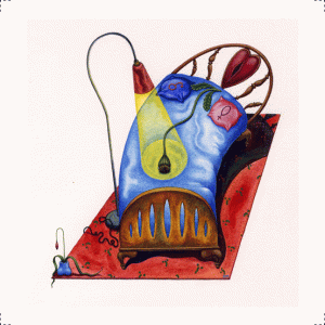
Finally we had a private viewing of “The Art of Lost Words” and a talk by the curator: Rebecca Pohancanek. The exhibition is full of pieces by different artists and designers, who were asked to take a “lost word” or a word that is no longer in use and in the dictionary and create a piece of work. There were some incredible pieces of work here, and this is something that really interested me as I love words… You can see the exhibition here and find out more here.
A very inspiring day all in all, and has made me remember why i wanted to be a Graphic Designer. I have loads of ideas for some personal work, and some time off coming up when I hope to start work on some of them… For more information on the Message Research group, have a look here.
TTFN,
Laura


